A Different Lens
Why a different lens? I’m excited to share here today. But, before reading on, if you want more information about me, check here.
And, if you are seeking weekly, colorful paintings in your inbox (yay!), sign up here. On to this week’s painting.
Seeing in Color
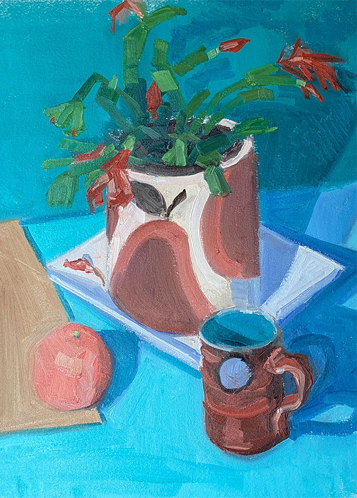
One of the painting ideas I have been thinking of lately is color. You might be thinking why of course you are thinking of color. But I have added a challenge; how little color can I use to get a painting result?
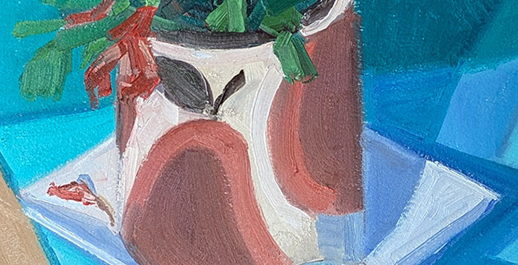
There are so many ways to approach this problem. This week I’m sharing a painting with limited numbers of colors. Essentially, I’m choosing a primary color (red, yellow or blue) equivalent to communicate primary colors. So instead of red, I’m using cadmium orange and instead of blue I’m using Phthalo Turquoise. These two colors plus yellow ochre and titanium white equals the palette.
Even though my brain works hard to paint this way, I love the results. There’s so much harmony in the outcome. And who doesn’t need a bit more harmony these days, right? Here’s the 12×16 inch oil painting on Arches Oil Paper.
Art In Real Life
You can see this painting in real life at the fab and fun Forest Park Art Show at the Brown House Gallery spring time art show coming up in downtown Raleigh. Here’s the who, what, where, when. You, gentle reader, are the “why!”
Forest Park Art Show
1310 Hillsborough Street
Raleigh, NC 27605
Sunday afternoon, April 12, 2026
2:00PM to 5:00PM
Please invite friends and family to stop by and see paintings, photos, sculpture, live music and more. Yes we will have snacks and beverages too. All the artists will be there and we each would love it if you stopped by and said “hi.”
We think you might enjoy seeing the world through a different lens.
How About You
How are you gentle reader? Are you using a different lens to see your world? If so, I would love to know more. Share here in the comments and thank you!
Thank you. I look forward to the exhibit on April 12.
Hi Eileen,
Yay! I really look forward to seeing you. Take care till then xo
I love how many rich and varied colors you created with a limited palette, Julie! I enjoy working with a limited palette and often do. Personally, too many colors confuse me and create a lot of anxiety! I’ve tried doing it for years and it’s never worked for me. Then I read about limited palettes and started experimenting and was amazed at how many colors I could create and accurately replicate how I saw my subject matter.
I also really like the depth you created with your colors as well as how you composed the still life. Lovely! xoxo
Hi Alexandra,
Color is so alluring, isn’t it? Like you, I have really learned to see that less is more. And, there’s always more to learn and see in this painterly world in which we live. Soooo grateful for that and our shared journey along the way. xoxo
Wow wow wow! Absolutely love these colors and this still life painting. Plus love the experimentation. That turquoise is stunning whether full color or in the shadows.
Hi Beth, Thank youuuuuu xoxo
Hi Julie-
I too love Phthalo Turquoise. It’s so lively! The curving motif on your flower pot
Catches my eye right away.
Hi Kathy, Phthalo turquoise is so lively, isn’t it? TY for looking and seeing it and the crazy flower pot that my friend, Barb, gave me. xoxo